Wednesday 11 October 2017

Walid Raad / The Atlas Collective

Walid Raad is best known for his long-term project, creating the fictional "collective" of artists, the Atlas Collective. Raad is from Lebanon, and most of his works deal – one way or another – with the troubled history of this country.

His work often revolves around the presentation of forms of 'documentary' or 'archival' evidence, but  the accumulation of images and text (often describing or brushing against violent historical events) in fact only leaves us profoundly uncertain as to where the boundary between fact and fiction lies. Raad creates a whole series of made-up (or are they?) characters, who are supposed to have bequeathed material to the Atlas Group's archive, and whose often traumatic biographies are layered over the material they present.

The work thus explores the nature of archives and their production of historical and collective forms of memory.

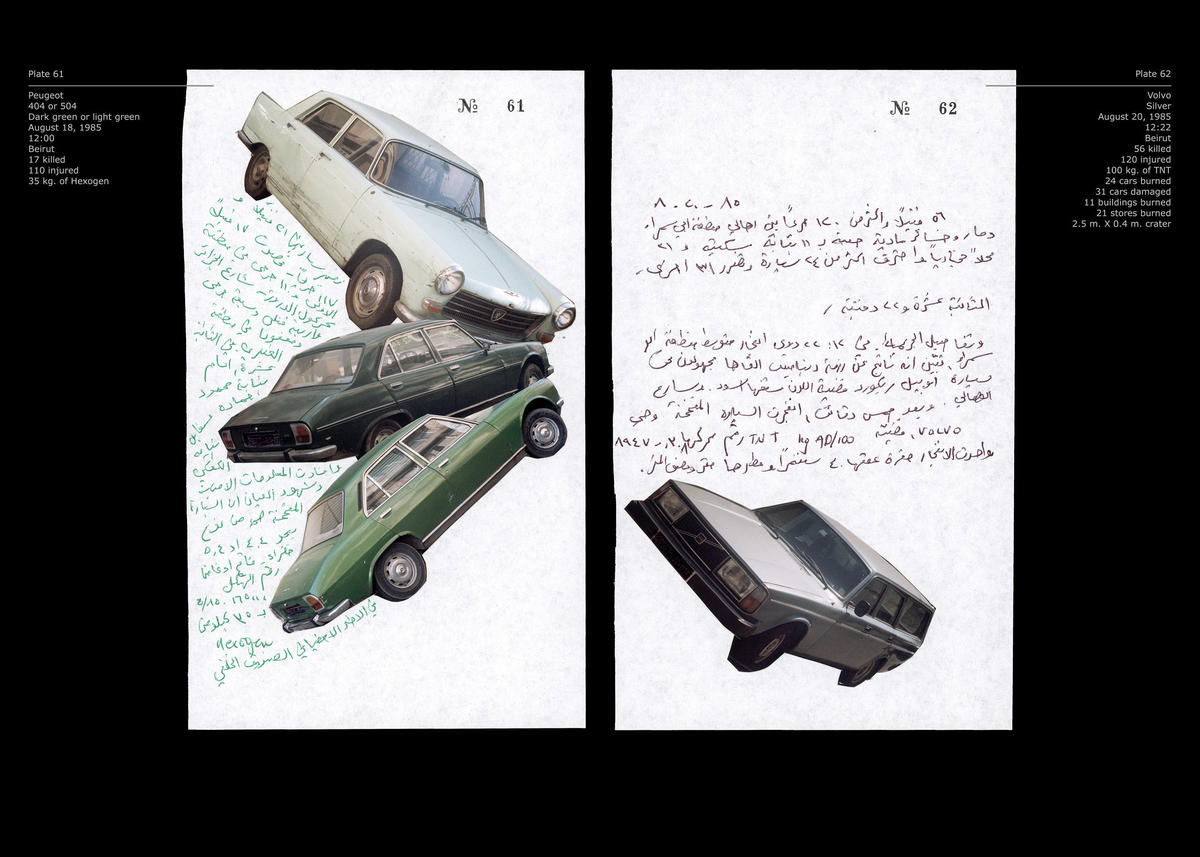
The image below, for example, claims to be from the notebook of one Doctor Fakhouri, a historian, listing the models of cars used for bombs between 1975 and 1991, and the text in Arabic gives information about the time and place of the explosion, its victims, the area that was damaged, etc.


Notebook volume 38: Already been in a lake of fire 1991.


For more on Raad's work, you could read the following article:
http://www.e-flux.com/journal/69/60594/walid-raad-s-spectral-archive-part-i-historiography-as-process/

Bob and Roberta Smith

Patrick Brill – working under the pseudonym Bob and Roberta Smith – places the production of hand-made signs, with playful slogans on them, at the heart of his practice. The work is full of (self-deprecating) humour, but also sets itself out in a series of political causes. Whatever the particualr message of the signs, their "DIY" ethos militates for an egalitarian ethos of amateur creativity, social engagement, and self-empowerment.


Bob and Roberta Smith, Make Art not War 1997.

Xu Bing

Xu Bing is a Chinese-born artist, currently residing in the United states. His work plays with the nature of Chinese script.

His work (below) Tienshu (A Book from the Sky) is an installation comprised of printed books and hanging scrolls, bound carefully in the traditions of Song and Ming Dynasty publications. The text, however, is made up of some 4,000 characters that though they look like Chinese characters in fact don't mean anything at all. Xu designed the characters, carved them into wooden blocks and used traditional typesetting techniques to produce the text.

The work - perhaps – explores the (perhaps oppressive) weight of culture and writing, the anxiety of meaning, the absurdity of modernity, and our relation to words and meaning-making.


Xu Bing, Tianshu, 1987-91.
Xu went on to produce the "square word" system, which turns English words into what look like Chinese characters – exploring questions of cultural identity and global hybridity.

Xu describes and shows the system here, also raising the differences between 'calligraphy' and 'writing' as signifying forms.


A further article from the New York Times  is available here.

Thursday 21 January 2016

Laurie Anderson

Laurie Anderson's performances involve a synthesis of elements of music, performance (she plays in complex ways with voice and persona), visual/technological spectacle, and storytelling.


In the above story, Anderson tells a story about her dog. It seems at first a simple story, but – told in the wake of 9-11 – it carries allegorical resonances of political events and American attitudes after the terrorist attacks...


Anderson made her splash in popular culture with the chart-topping song O Superman, back in the 1980s. Anderson's song was at the time technologically innovative, and strangely haunting. Its lyrically complex, with dense imagery where, again, the domestic slides into the political and the homely (even cutesy) and the uncanny collide...


Chris Marker

filmmaker Chris Marker is a master of the play between image and word. His masterpiece is probably Sunless/Sans Soleil (1983), which weaves all kinds of mystery in the gap between voiceover and image, in the juxtaposition of images, and in the play between words.

This is how the film starts:


Victor Burgin

Much work around the relation between text and image has been done by photographers – perhaps because our everyday experience of photography is so frequently mediated by the written word, and we are quite accustomed to reading between photographic images and text from existing formats of the media.

A key figure – both a photographer and a prolific writer of photographic theory – who explored the artisti plays between image and text during the 1970s was Victor Burgin.


Victor Burgin,  Possession (1976).


The poster above was flyposted around the city. It plays on (and appropriates) advertising imagery and asks about questions of 'property' in terms of gender and sex as well as social equality. Of course, today's society is actually far more unequal than the one Burgin described back in 1976. At the time of my writing (Jan 2016) this there was has been within the newspapers in the last week a study which has noted that a mere 62 of the world's richest people own more than the poorest half of the world's population. Burgin's question might come back to us again today: What does possession mean to us?

Sensation, 1975

Burgin's work of the 70s also looked at questions of gender and at the way that the fashion industry worked.

Life Demands a Little Give and Take (1974)
Burgin often played with the appropriation of different modes of writing (in the above, a kind of advertising speak), and their contrast ('montage') with disparate images.

Wednesday 14 October 2015

Jenny Holzer

Another classic artist working with text in an art context is Jenny Holzer. In her series, the Truisms (1977-9) Holzer flyposted a series of short, enigmatic, slogan-like phrases across the urban landscape of New York, and in doing so initiated an extended exploration of he ways that text-works could be inserted into – and actively intervene within – the fabrics of the everyday world. Her exploration of this has taken the form of LED displays, advertising sites, building signage, t-shirts, polystyrene cups, and video projections. The work often interrogates the links between language, authority, space and power. and between personal and impersonal voices.

Jenny Holzer, Protect Me from What I Want, c.1982 (?), Times Square, New York.
It is in Your Self-interest to Find a Way to Be Very Tender (installed on the marquis of an abandoned movie theatre in Chicago; part of the "Truisms for Survival" Series, 1983–5.)

For London, projection, 2006.